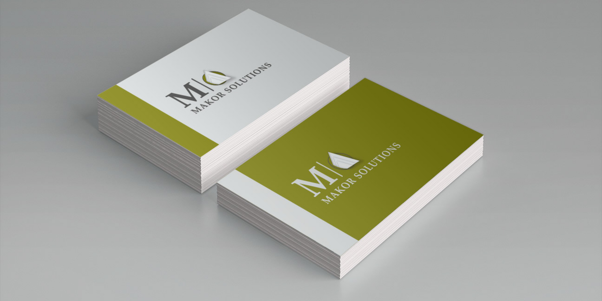
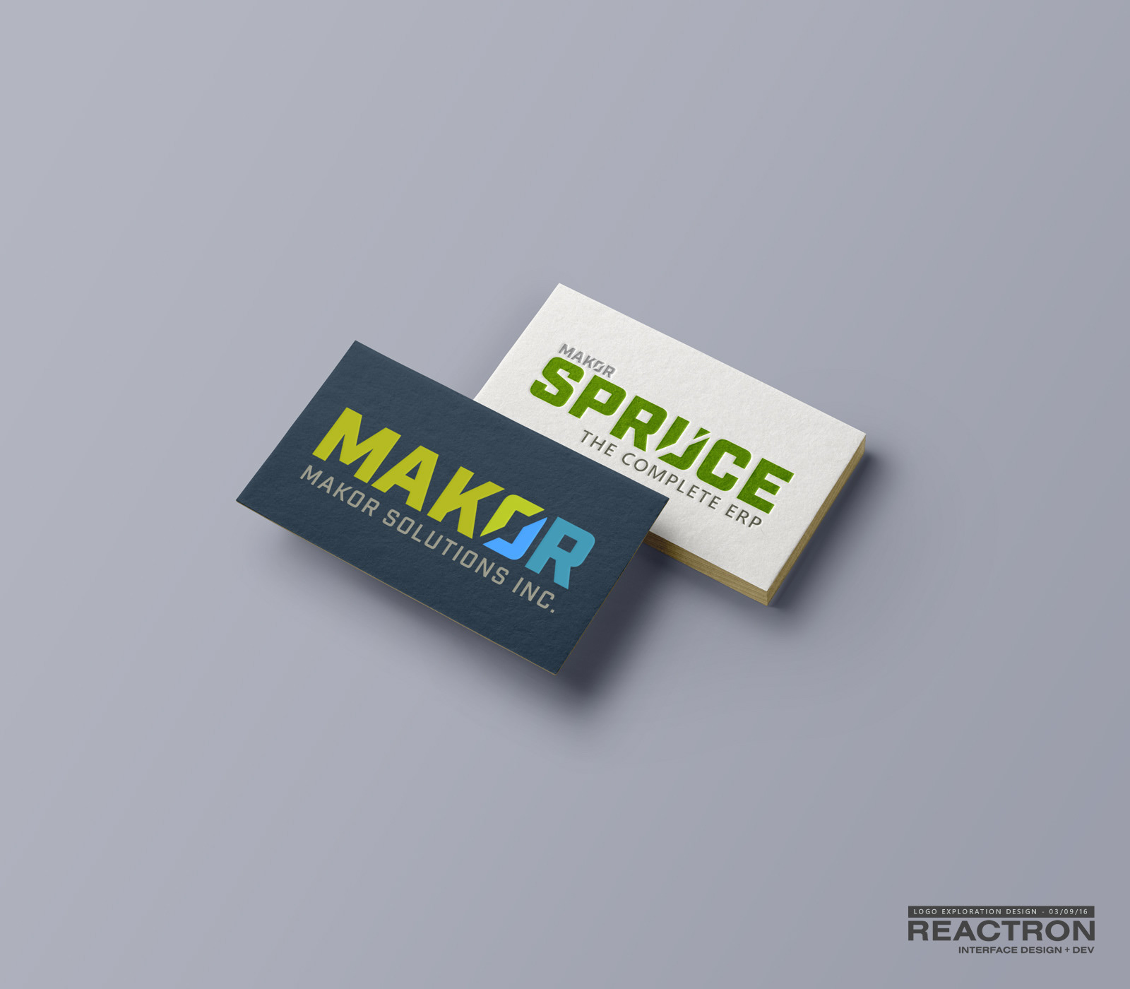
Before: 10 years ago I helped Makor Solutions with a new logo, business cards and a unique website with seamless animated Flash banner. Not too shabby, but we all agreed it was time to step up and over the competition.

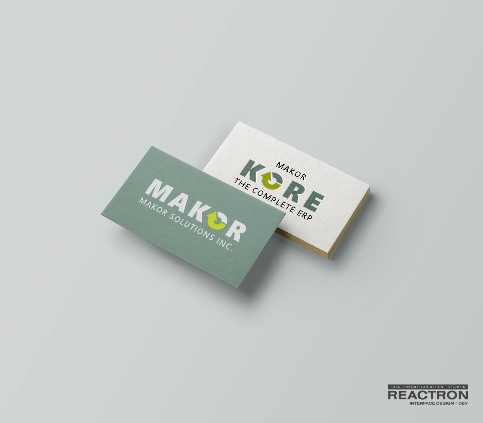
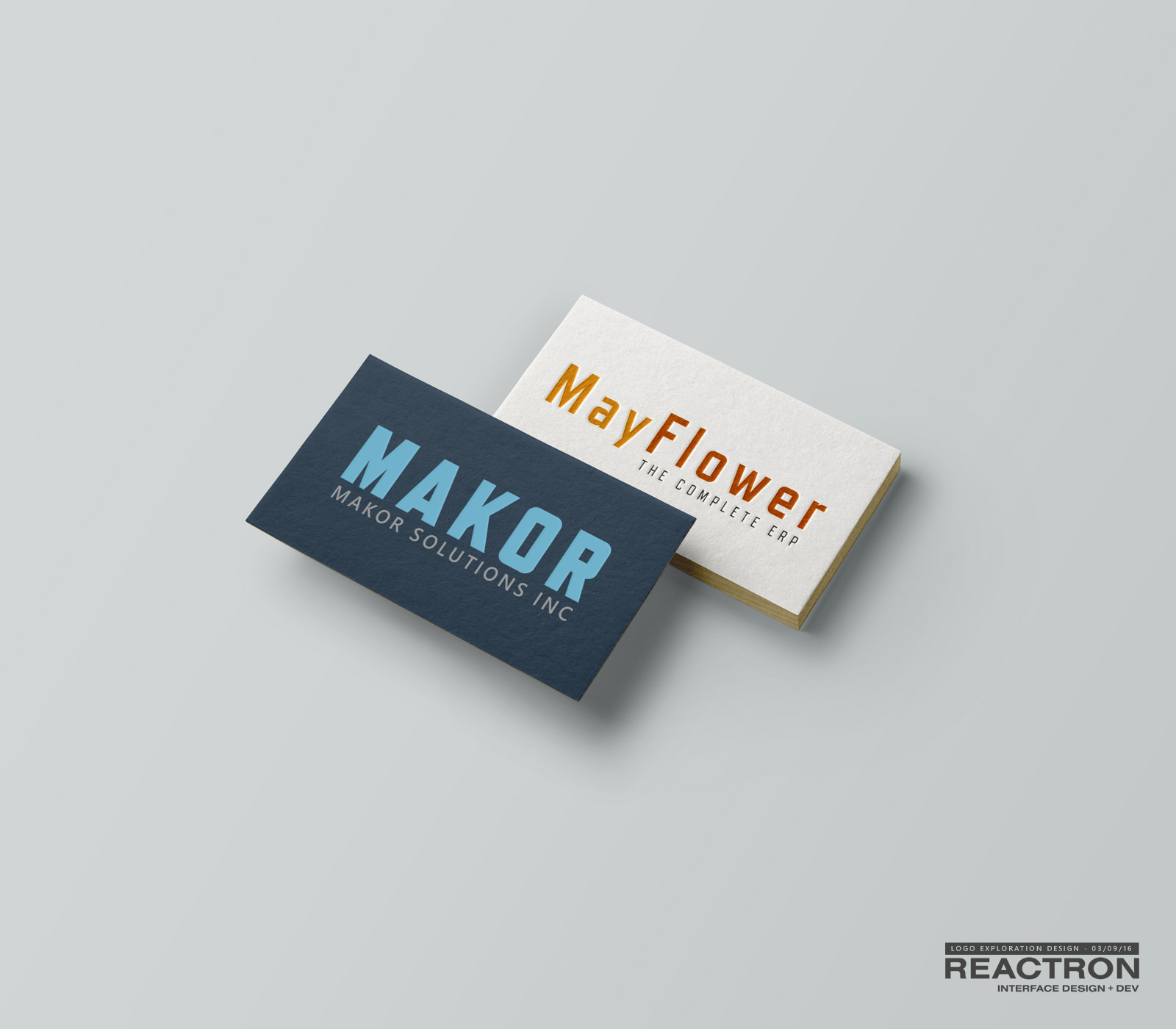
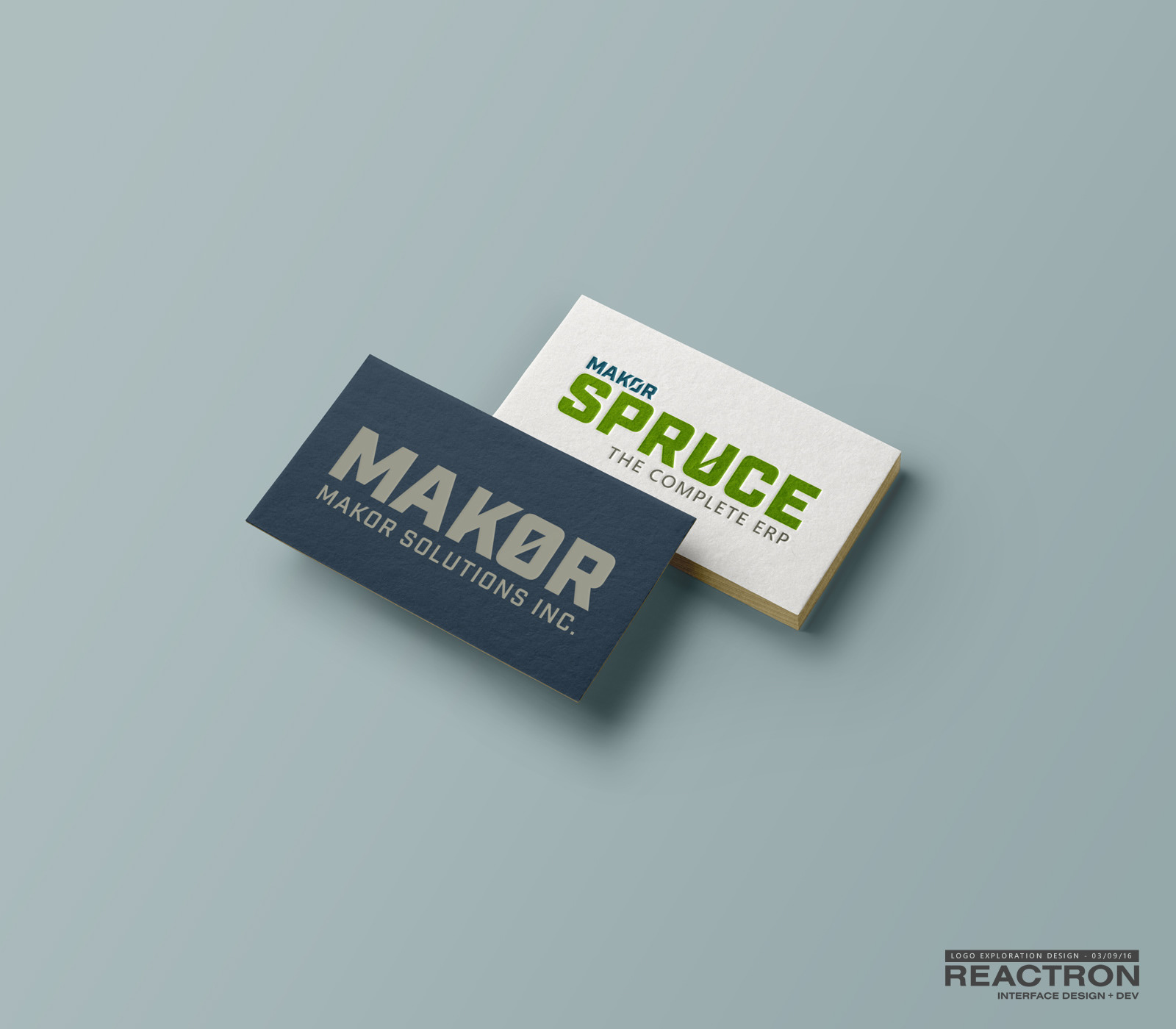
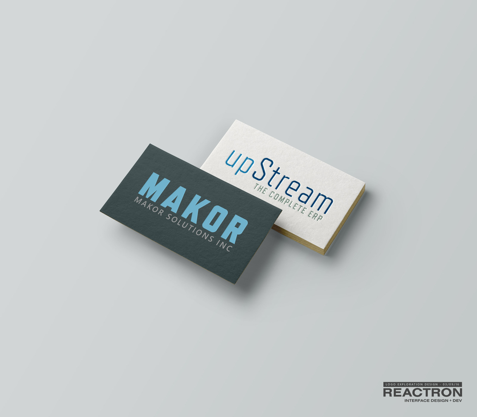
Concepts: Brand and product name
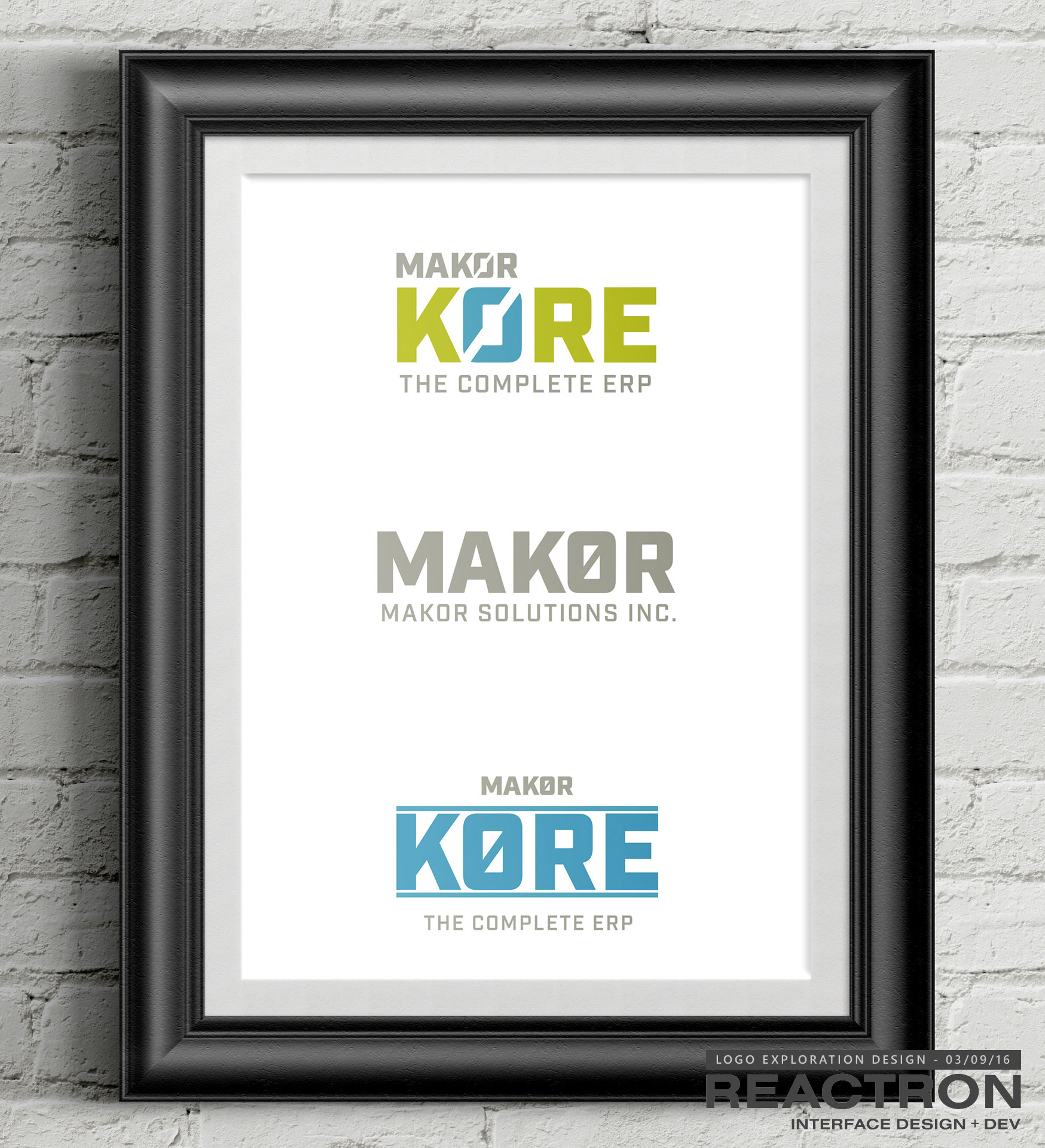
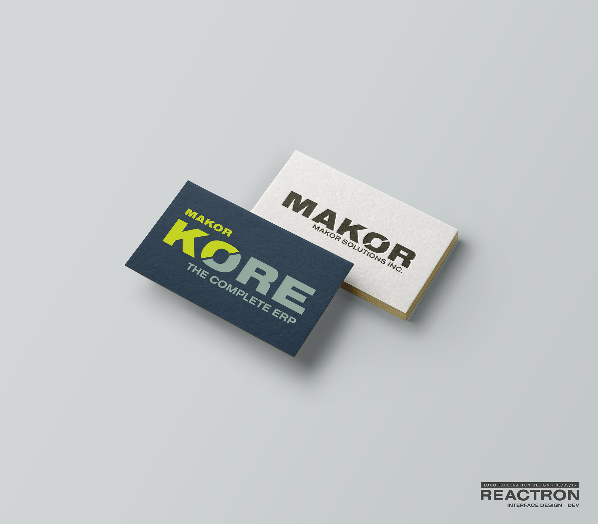

Winner
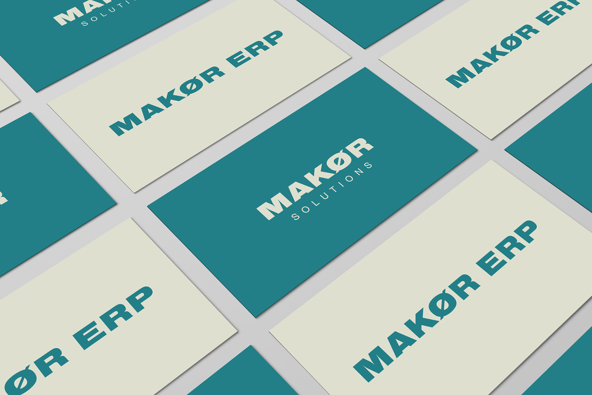
A key to logo design is to stay on shape first; black on white, or in this case; blue on white. One the shape is solid, you can get crazy with color choices. While it's more rare these days, there are still times when you need a single or reverse color version of the logo. We're set.
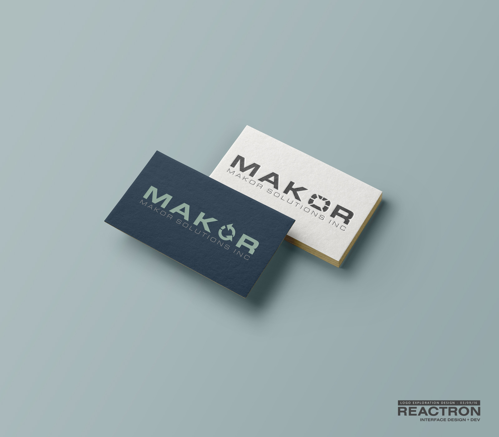
Color Theory

The New Website:
The client wanted a single color for the product logo. Watch how we were able to use the parent brand colors for the design of inline graphics on the website.

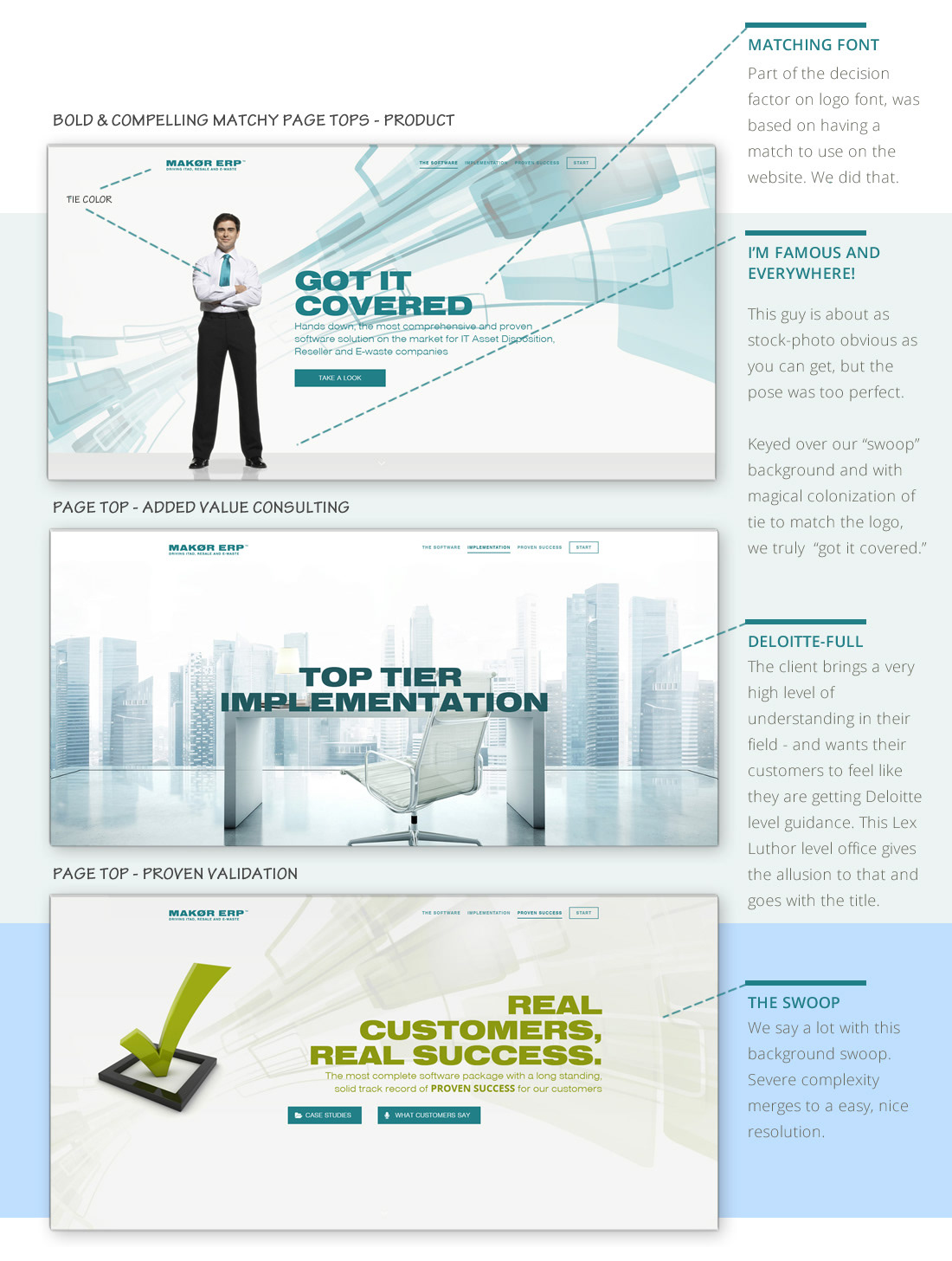
Note the consistency: Blue primary color, Makor accessory colors and attribute icons. When there is more time, I'd like to "relight" this 3D scene. It looks like it should be realistic, but is off. Why? Lighting.
Results
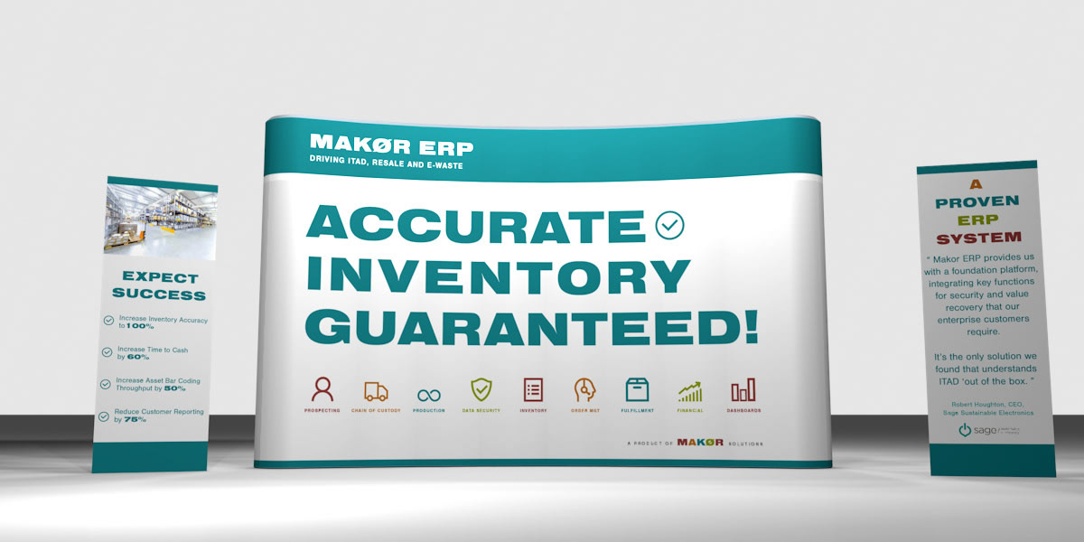
Just in time for a key annual trade show - Makor showed up now confident their strong message and brand materials matched their leadership position in the space.
"We are being presented in a professional, mature light – and that is exactly what we are. "
- Mark Chodos, CEO
- Mark Chodos, CEO
Visit project at www.makorERP.com